Hero banner — replace with your own image

There is a lack of intrinsic playful experiences in adult lives. Urban environments are often designed for navigation and productivity, leaving little room for imagination or spontaneous engagement. Evanescent is an interactive digital experience that invites audiences to re-experience their commuting routine.

[ 2026 ]

Roles

UX/UI Design
Wayfinding
Spatial Design

Client

Academic
Group Project


Brief background — replace with your own image

Brief

The brief for this project was to identify "Identify a gap or a problem in our society, then design and develop a means to incorporate an intrinsic sense of "playfulness?"

Research Question

"How can we disrupt urban commuters and entice curiosity while changing perspective."


Approach

Findings

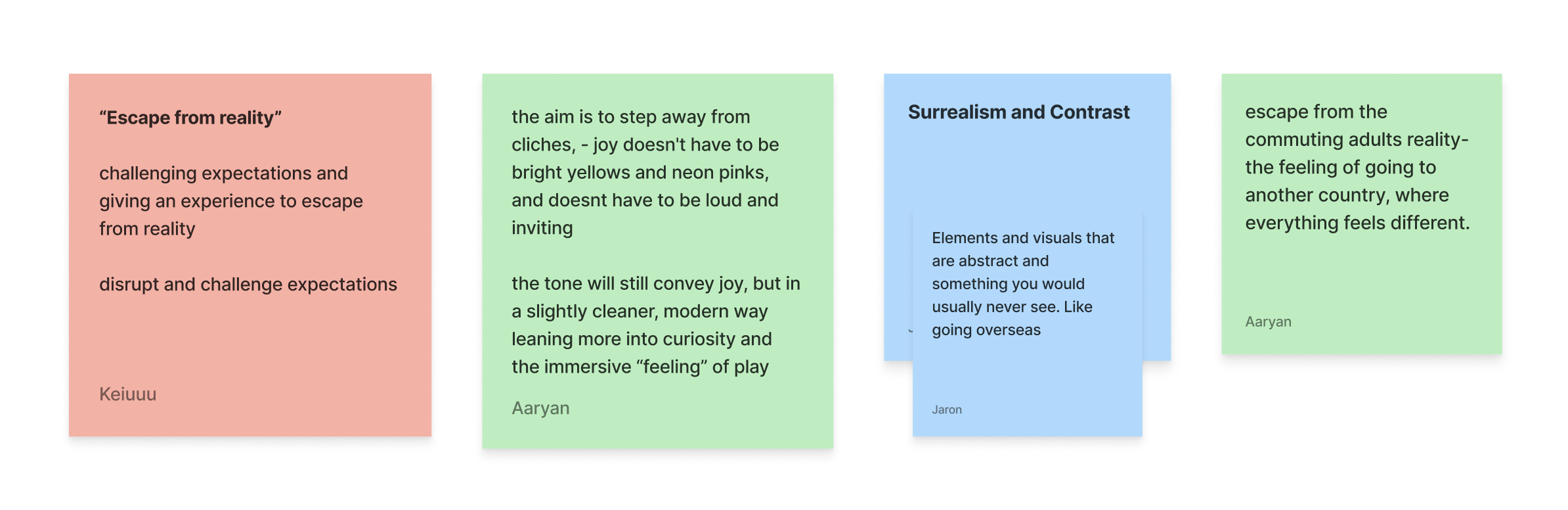
Based on the research my team and i found that commuting is an important part of daily life in New Zealand, connecting people to work and everyday activities.

However, it is also a source of stress and anxiety for some commuters due to its fast passed and rushing nature.

The Problem

"Urban commuters in Auckland are trapped in repetitive, mundane routines that numb curiosity and attention, leaving little room for spontaneity."

SO HOW CAN
WE CHANGE THAT?

Ideation

Ideation image — replace with your own

We wanted to create an experience that would have a lasting impression with commuters. To bring some spontaneity and curiosity into there life. My team lead Jaron identified Surrealism as the core visual direction for the project due to its playful nature and its potential for unique installations.

Solution

We landed on creating an Surrealist Exhibition, the goal with it is to get commuters to have a change in perspective and see things they usually wouldn't see. Breaking there usual routine and getting them to view things differently.


Processes

Field review main — replace with your own

Field Review

My team went to a range of locations around Auckland city and identified Bledisloe Lane to be a good location because of its high foot traffic to host our exhibition within it.

Field review 2 — replace with your own Field review 3 — replace with your own


Installation Ideas

Individual we brainstormed and created some concepts for installations and my eye tracking idea was one we chose to further develop.


Visual Direction

As a team we collaboratively added input towards the visuals and the overall look for the exhibition.

Visual direction — replace with your own


Eye Follow – Installation

Eye lo-fi — replace with your own

Lo-fi Version

For the eye tracking installation I sketched the eye socket and iris separately on Procreate which would allow Jaron to bring the eye to life with HTML, CSS and JavaScript on the browser.

Eye hi-fi — replace with your own

Hi-fi Final Version

Through further refinement the final eye-tracking illustration for the installation was finalised as well as applying the visual direction to keep everything consistent.


Website

SURREALISM
VISUALS
DEEPER
UNDERSTANDING
TOOL AND OR
GUIDE

As an extension of the exhibition, we wanted to create a website that reinforced the surrealist visuals and be an additional guide towards the experiences as whole. providing deeper context into installations.

User Flow

I worked with jaron to develop a lo-fi version of what the website as to what could potentially look like along with the additional pages

User flow — replace with your own

Final Website

through further iterations and testing this was the final flow of the website. it uses scrolly telling through to paint a strong narrative for the exhibitions experiences.

Final website — replace with your own


Spatial Design

To ensure the exhibition experience was not overwhelming, I created a 3D model of the alleyway in Blender and placed each installation within the space. This allowed me to carefully consider spacing and visitor flow, ensuring each experience had room to be engaged with individually.

Spatial design main — replace with your own
Spatial design top right — replace with your own Spatial design bottom right — replace with your own


Wayfinding

To further guide visitors towards the exhibition, I explored the development of wayfinding elements for the surrounding area, helping to spark curiosity towards the journey to the exhibition space.

Final wayfinding 1 — replace with your own Final wayfinding 2 — replace with your own

Final Wayfinding

In the final design, I chose to keep the wayfinding simple. Which would be achieved through floor decals inspired by the exhibition logo, along side a signage post positioned on the side of the exhibition with the highest foot traffic to maximise visibility and guide visitors towards the experience.

Outcome

Outcome image 1 — replace with your own Outcome image 2 — replace with your own Outcome image 3 — replace with your own Outcome image 4 — replace with your own Outcome image 5 — replace with your own Outcome image 6 — replace with your own
← Previous project Next project →