
Hero banner — replace with your own image

There is a lack of intrinsic playful experiences in adult lives. Urban environments are often designed for navigation and productivity, leaving little room for imagination or spontaneous engagement. Evanescent is an interactive digital experience that invites audiences to re-experience their commuting routine.

[ 2026 ]

Roles

UX/UI Design
Wayfinding
Spatial Design

Client

Academic
Group Project


Brief background — replace with your own image

Brief

The brief for this project was to Investigate and produce a creative project that explores a context, subject, and medium within the field of media design.

Research question

“How can an interactive experiences when applied with data humanism be used to understand the impact of sleep and spark self reflection?”
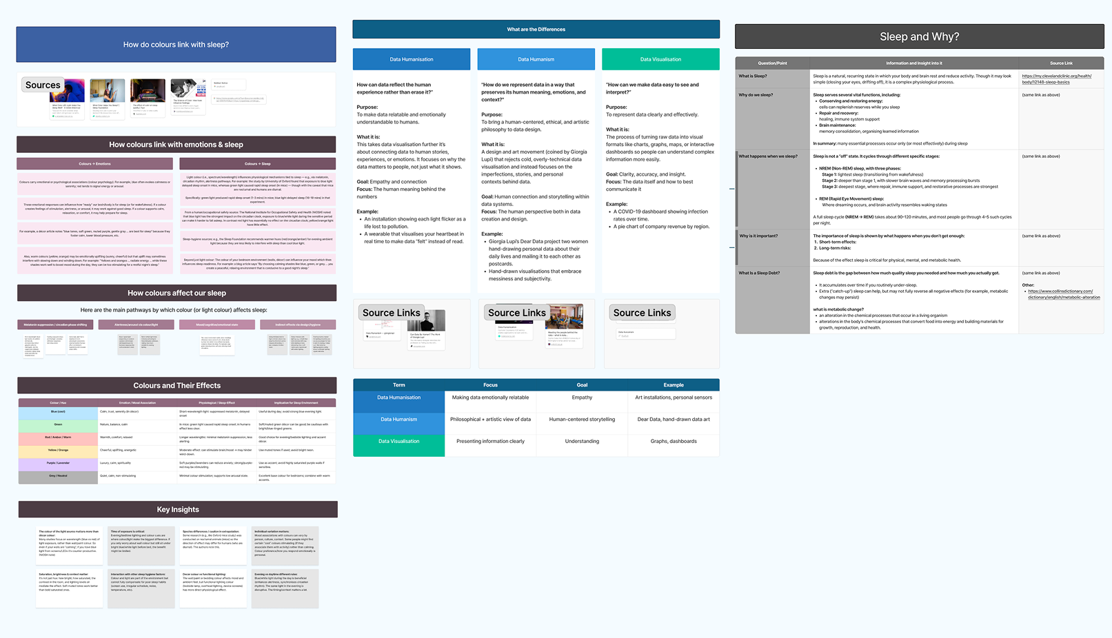
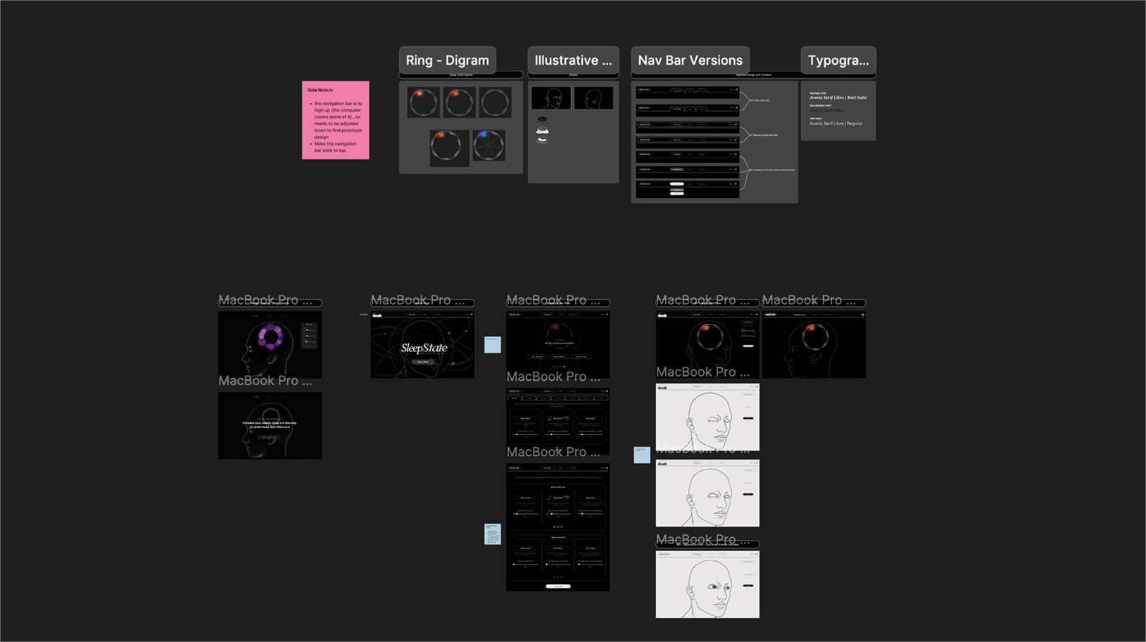
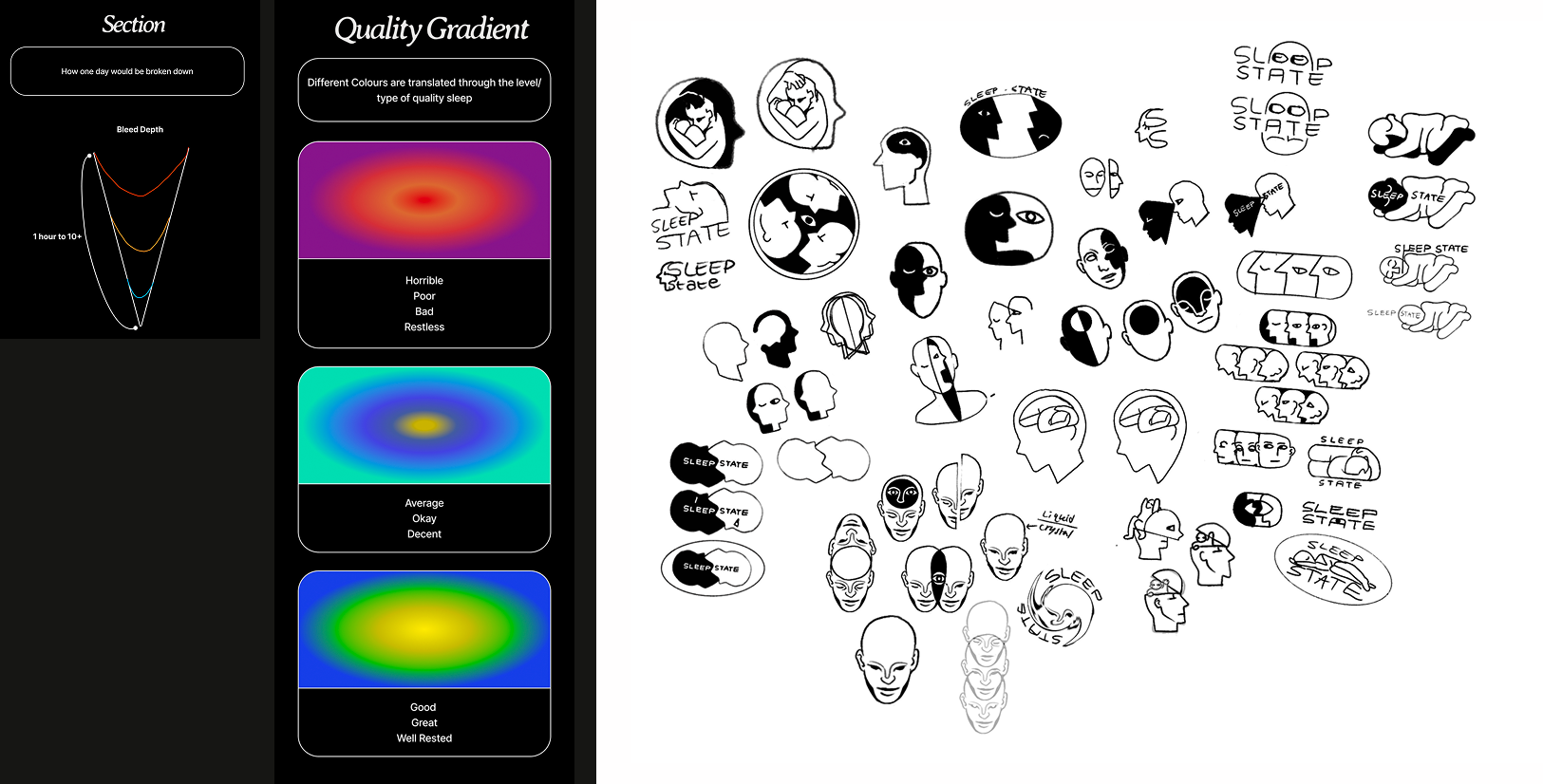
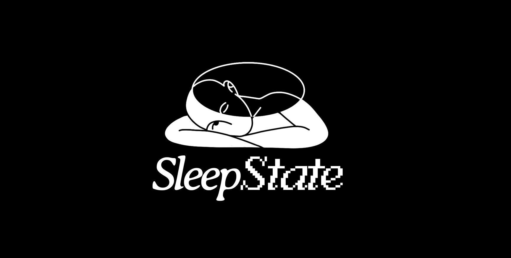
Approach

Findings

Research played a major role in shaping the foundations. Investigation into the effects of poor-quality sleep revealed how strongly sleep impacts focus, mood, productivity as well as overall wellbeing, particularly for teenagers and young adults aged 15–25 balancing study, work, and early mornings.

Findings image — replace with your own

Problem

Although poor-quality sleep impacts focus, mood, productivity, and overall wellbeing. Many young adults struggle to understand their sleep patterns as existing sleep data lacks meaningful and engaging visual communication.

Solution

My approach to dealing with this was to create data visualisation application that is heavily rooted in creating a connection between there sleep patterns an quality and turning into unique visuals to track and follow.

Processes

User testing

User testing and wire-framing helped gauge the tangibility, usability, and comprehensiveness of the concept. Early wireframes helped map out the user journey, layout, and flow interactions of the platform before moving into final visual designs. Feedback from participants helped refine how the data displayed was legible and could be easily and interpreted.

User testing image — replace with your own

Visual direction

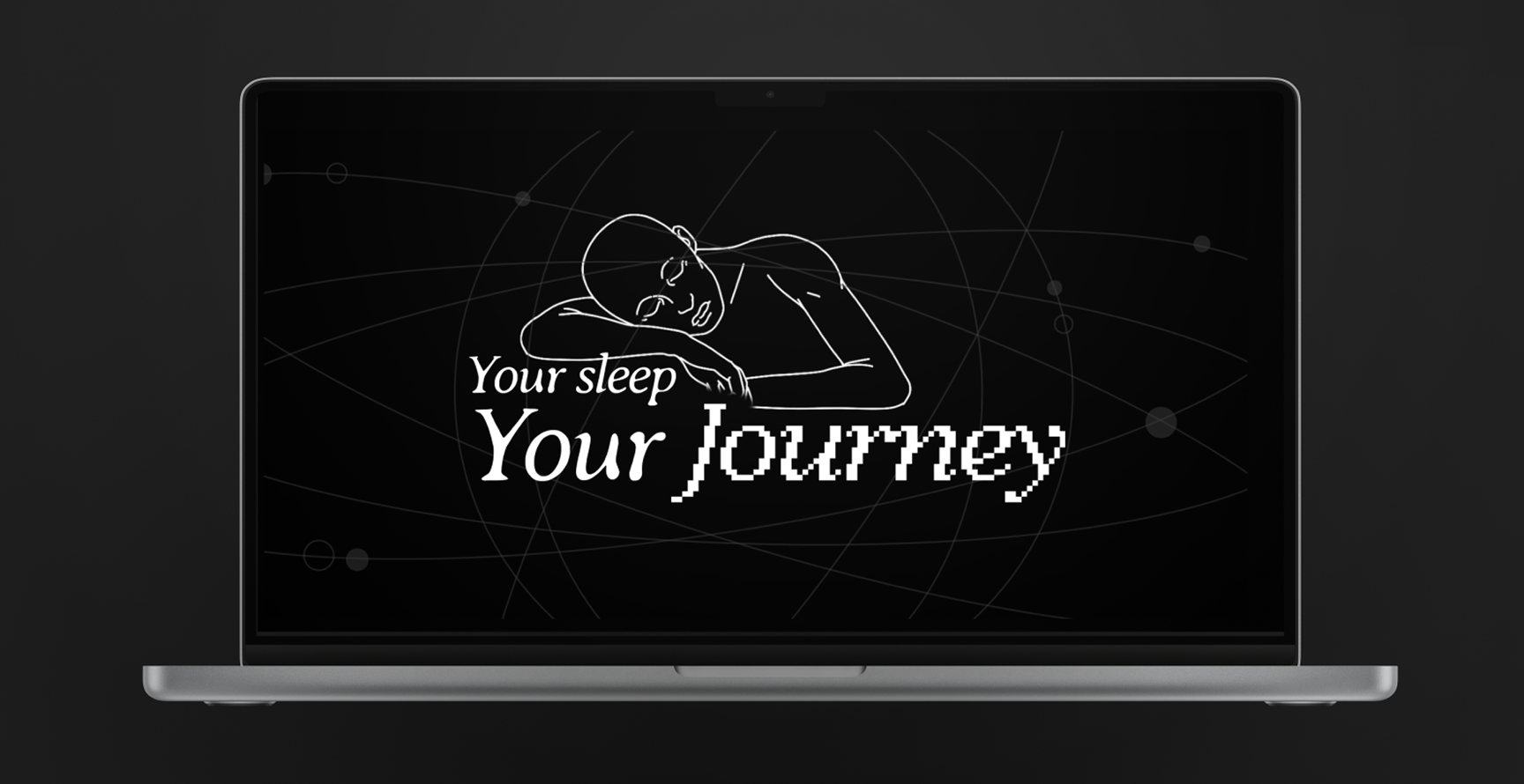
Illustration and visual storytelling played a core roll to make the experience feel approachable and engaging. Using black and white visuals as the main branding, colour gradients for the personal data and illustrations of more gender neutral forms creating a more calming digital visual experiences.

Visual direction image — replace with your own

Outcome

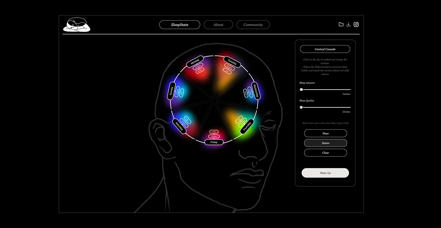
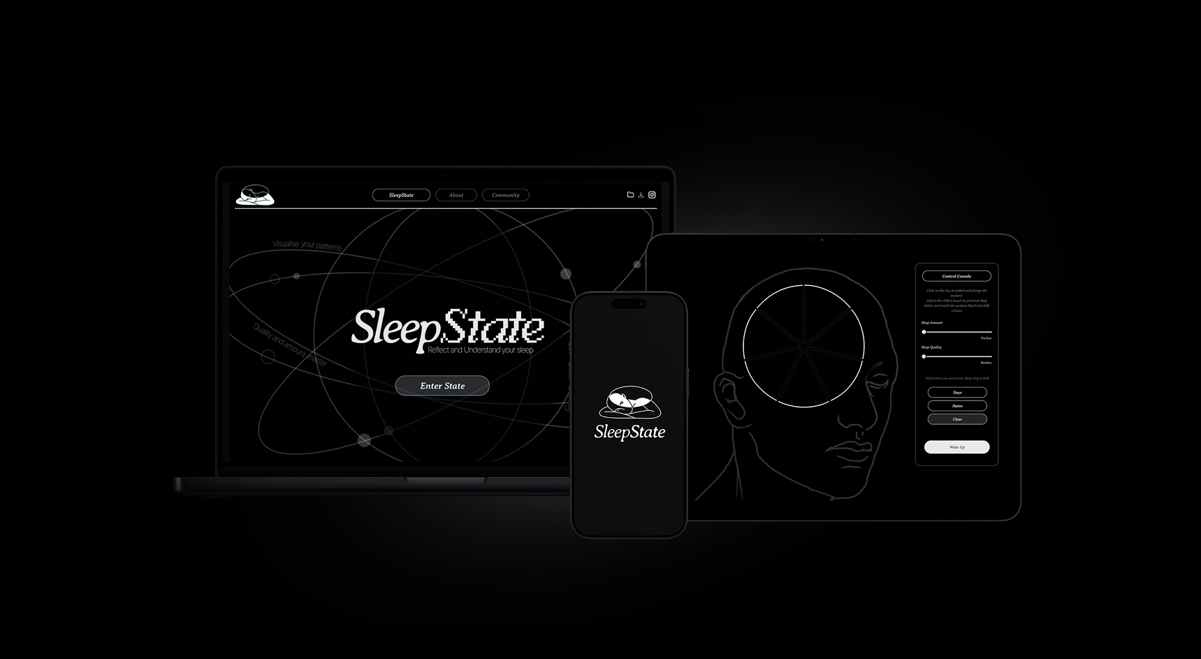
The final outcome was a sleek and visually cohesive platform centred around data visualisation to create personalised sleep rings. The interface allows the data to be the focal point, while colour gradients communicate the quality and duration of sleep in an engaging and easy to understand way.

Outcome image 1 — replace with your own Outcome image 2 — replace with your own Outcome image 3 — replace with your own Outcome image 4 — replace with your own
← Previous project Next project →